
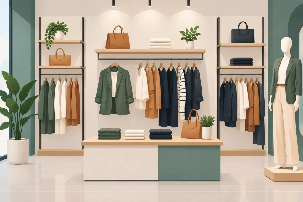
A strong fashion wall merchandising example does more than fill a blank perimeter wall. It gives shoppers a quick read on the collection, creates natural outfit pairings, and turns vertical space into a productive selling area. For apparel retailers, brand outlets, department stores, and fit-out teams, the wall is often the most visible merchandising surface in the store. It should work as hard as the merchandise on the sales floor.
Consider a 16-foot wall used for a new casual womenswear collection. The most effective arrangement is not a continuous row of garments. Instead, it is a controlled composition: mannequins or torso forms establish the look, face-out garments create impact, shelves carry folded layers and accessories, and hanging rails provide depth and size availability. The result is a display that communicates a complete story while remaining practical for replenishment and customer handling.
A Fashion Wall Merchandising Example That Sells Complete Looks
Start with one clear theme. A seasonal capsule, a color story, a workwear edit, or a weekend collection gives the wall a reason to exist. In this example, the theme is “Modern Casual Layers” in neutral tones, denim blue, and one accent color. The wall is divided into three visual zones, with the center acting as the focal point.
At the center, a female torso mannequin wears a complete outfit: a lightweight jacket, knit top, straight-leg denim, and crossbody bag. Place this display at approximately eye level so it becomes visible from the main customer walkway. A back panel in a contrasting but brand-appropriate finish helps separate the silhouette from the wall and gives signage a clean background.
On either side, use face-out arms to show two coordinating hero pieces. A face-out jacket or dress gives shoppers an immediate view of shape, fabric, and color. This is far more effective than presenting every item side-on along a rail, particularly from a distance. Beneath each face-out item, a short hanging rail holds the same product in multiple sizes or presents a related garment such as trousers, shirts, or skirts.
Below the center mannequin, install two or three adjustable shelves. Folded knitwear, denim, or T-shirts add texture and offer accessible stock. A small acrylic sign holder can identify the collection, outfit components, or promotion without cluttering the display. Accessories such as handbags, belts, caps, or footwear should be placed where they reinforce the outfit rather than appearing as separate inventory.
The left and right zones need balance, not perfect symmetry. One side may feature a long garment like a dress or coat, while the other uses a shirt-and-trouser combination. The key is to maintain similar visual weight. If one side is dark and dense, the opposite side needs enough color, volume, or display hardware to prevent the wall from feeling unbalanced.
Build the Wall in Layers, Not Rows
The common mistake in fashion fixture planning is treating the wall as extra hanging capacity. Capacity matters, especially in high-volume stores, but too many garments reduce visibility and make premium merchandise look less considered. A wall should present a curated selection first, then support available stock.
The most reliable format is a three-layer structure. The first layer is the backdrop: slatwall, gridwall, laminate panels, perforated panels, timber-effect surfaces, or branded graphics. This layer sets the visual standard and determines what fixture accessories can be installed.
The second layer is the display hardware. Adjustable shelves, face-out arms, waterfall arms, hanging bars, shoe shelves, bag hooks, and mannequin brackets allow the wall to serve different categories over time. Modular systems are especially useful for retailers that refresh collections frequently or operate multiple locations with standardized layouts.
The third layer is the merchandise itself. This is where spacing matters. Hero products need room around them. Folded stacks should be neat but not excessively high. Hanging garments should have enough separation for shoppers to identify individual pieces without disturbing the full display.
For commercial projects, fixture flexibility is a major purchasing consideration. A fixed installation may look refined on opening day but become limiting when the product mix changes. Adjustable wall merchandising systems protect the initial investment by allowing the same display surface to support shirts one season, bags the next, and promotional signage during a campaign period.
Use Vertical Space With Purpose
Not every part of the wall has equal selling value. The central area at eye level should carry the newest, highest-margin, or most visually distinctive products. This is where customers naturally pause and where full looks have the strongest effect.
Upper wall sections are suitable for large-format brand graphics, illuminated logo elements, lightweight display props, or limited stock that does not need frequent customer access. Avoid placing core apparel stock too high. If customers cannot comfortably reach or inspect it, the display becomes decorative rather than functional.
Lower sections work well for folded basics, footwear, bags, and replenishment stock. They can also accommodate drawers or lower cabinets where stores need additional back-up inventory without losing sales floor space. In a compact fashion store, this combination of open display and concealed storage can make a significant difference to daily operations.
Lighting should support the vertical plan. Track lighting directed at mannequins and face-out displays adds contrast and guides attention to focal merchandise. Even lighting across an entire wall can make the space feel flat. However, highly concentrated lighting can distort color or create shadows, so fixture positioning should be tested with the actual garment materials on display.
Match Fixtures to the Merchandise Category
The best wall fixture package depends on what the retailer sells. A denim-focused brand requires strong hanging rails, folded product shelving, and clear size organization. A boutique dress retailer may need more face-out arms and longer drop space. Sportswear stores benefit from flexible shelves, mannequins, graphic panels, and accessory hooks that help create complete performance or lifestyle looks.
Material choice also affects perceived value. Chrome and black metal fixtures suit contemporary, urban, and performance-oriented retail environments. Timber finishes can support lifestyle, resort, or premium casual concepts. Acrylic risers and sign holders are useful for accessories and messaging but should be used selectively. Too many small display elements can make a fashion wall feel busy.
Durability should not be an afterthought. Wall-mounted systems must handle the load of garments, accessories, and frequent customer interaction. Commercial-grade brackets, rails, shelf supports, and secure fixings are necessary, particularly in high-traffic stores and multi-location rollouts. Fit-out contractors should confirm wall construction, fixing points, and load requirements before selecting the final system.
Keep the Display Easy to Shop and Maintain
A visually strong wall fails if store staff cannot replenish it quickly. The fashion wall merchandising example described above works because it has a clear structure that can be reset without rebuilding the entire display. Staff know which items belong on face-outs, which products are folded, and where accessories should sit.
Use consistent hanger types and garment direction. Keep size sequencing logical on hanging rails. If the wall includes a promotional message, make sure the advertised products are immediately visible and available. Shoppers should never have to search the store for the items shown in a featured outfit.
Refresh the wall often enough to remain relevant, but not so often that teams lose consistency. A weekly visual check can address empty rails, collapsed folded stacks, mismatched hangers, and missing signage. A more complete refresh may follow delivery cycles, campaign changes, or seasonal launches.
There is also a practical trade-off between visual density and stock depth. A flagship store with frequent replenishment can use a lighter, more editorial display. A store with limited storage or slower deliveries may need slightly deeper stock on the wall. The answer depends on store volume, replenishment capability, and the value of the collection being shown.
Plan for Brand Consistency Across Locations
For chains and multi-site retail projects, a wall merchandising plan should be repeatable without becoming rigid. Specify the core fixture types, recommended mounting heights, spacing guidelines, and approved signage positions. This gives each store a reliable framework while allowing local teams to adapt products to their available inventory.
JS Retail Displays supports retail projects with fashion fixtures, shelf merchandising components, acrylic display solutions, signage systems, and other commercial presentation products that help create organized, high-performing store environments. Selecting compatible components from one supply partner can simplify sourcing and help maintain a consistent finish across the project.
A good fashion wall does not need to show everything. It needs to make the right products easy to notice, understand, and buy. Start with one collection story, give hero items visual priority, and choose fixtures that can keep pace with the way your store sells.