
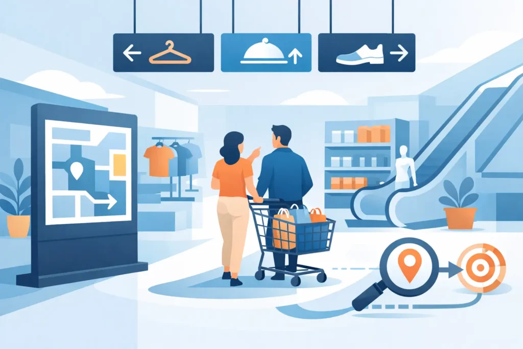
A customer who cannot find an aisle, fitting room, checkout counter, or product category quickly is less likely to browse with confidence. This retail wayfinding signage guide helps store operators, fit-out teams, and retail project buyers plan signage that directs shoppers efficiently while supporting a more organized, sale-ready environment.
Wayfinding is not simply a collection of arrows. It is a coordinated system that helps people understand where they are, where they need to go, and what they can expect when they get there. In a supermarket, that may mean clearly identifying fresh food, household goods, and payment areas. In an electronics store, it may mean leading customers from mobile accessories to premium display zones and service counters.
What Retail Wayfinding Signage Needs to Achieve
Effective wayfinding reduces hesitation at key decision points. Customers should not need to stop at every aisle junction, search for staff, or walk the full perimeter of the store to locate a department. Clear navigation improves the shopping experience, but it also supports operational goals: stronger category visibility, better traffic distribution, fewer interruptions for staff, and more exposure for priority merchandise.
The best systems balance three functions. Directional signs tell shoppers where to go. Identification signs confirm that they have arrived. Informational signs explain rules, services, promotions, or next steps. A checkout arrow is directional, a sign above the bakery is identification, and a notice explaining return procedures is informational.
Each sign should have one primary job. Combining too many messages on one panel may seem economical, but it often creates clutter and delays comprehension. In high-traffic retail environments, a short, clear message usually performs better than dense copy.
Start With the Customer Journey, Not the Sign Type
Before selecting acrylic holders, hanging signs, poster frames, illuminated panels, or digital displays, map the typical shopper journey. Begin at the entrance and identify every point where a customer must make a decision. These points commonly include the entry zone, main cross-aisles, elevators or escalators, department transitions, fitting rooms, service desks, restrooms, pickup areas, and checkout.
A grocery store may need highly visible overhead aisle markers because customers shop from lists and want fast category access. A fashion retailer may use more restrained wall graphics and department markers to preserve the visual character of the store. A large-format electronics retailer may require strong service, warranty, collection, and payment messaging alongside product-category navigation.
Consider how different visitors use the space. First-time shoppers need orientation near the entrance. Repeat customers need quick confirmation as they move through familiar departments. Staff and delivery teams may also require back-of-house directional signage, especially in larger stores, malls, warehouses, and mixed-use commercial sites.
The layout should determine the signage plan. Do not attempt to correct a confusing floor plan with excessive signs. When circulation routes are unclear, signage becomes overloaded and less effective. In some cases, repositioning a promotional display, opening sightlines, or moving a service counter will do more for navigation than adding another sign.
Build a Clear Signage Hierarchy
Retailers need a hierarchy that shoppers can read in seconds. The largest and most visible messages should identify major destinations and navigation routes. Medium-scale signs should identify departments, aisles, and service points. Smaller signs should support local decisions, such as shelf labels, product-location notices, queue instructions, and price communication.
Primary navigation signs
Primary signs are normally placed above eye level or suspended where they can be seen across the sales floor. They identify major departments, key pathways, and essential services. Their design must work from a distance, so use concise category names, high-contrast colors, and simple directional symbols where appropriate.
In stores with tall ceilings, suspended signs can improve visibility without taking selling space from walls or fixtures. In lower-ceiling environments, wall-mounted panels, illuminated signage, or endcap-mounted graphics may provide better results. The right format depends on viewing distance, ceiling height, lighting conditions, and fixture placement.
Department and aisle identification
Once customers enter a zone, they need confirmation that they are in the correct area. Department headers, aisle blades, shelf-end signs, and category panels provide this confirmation. They should use the same naming conventions as the store directory, website, promotional materials, and staff language.
For example, avoid calling an area “Home Care” on an overhead sign, “Cleaning” on the aisle marker, and “Household Essentials” on a promotional poster. Consistency prevents unnecessary doubt and makes a multi-location rollout easier to manage.
Local information and decision signs
Local signs work at close range. They can identify collection counters, provide queue instructions, explain product handling rules, point toward fitting rooms, or show where a related category is located. Poster holders, acrylic sign holders, shelf talkers, and countertop displays are useful here because they can be updated without replacing permanent signage.
These signs should remain focused. A shopper standing at a service desk needs an immediate instruction, not a full policy document in oversized type.
Choose Materials for the Retail Environment
Wayfinding signs must withstand daily cleaning, customer contact, lighting exposure, and frequent merchandising changes. Material selection is therefore a commercial decision, not only a design choice.
Acrylic sign holders and wall panels offer a clean, professional finish for price information, department messaging, and replaceable printed graphics. Aluminum frames and poster displays are practical for campaigns that change regularly. PVC, foam board, and printed panels may suit short-term promotions or temporary store zones, while fabricated lettering and illuminated signs are better suited to permanent department identification.
Digital displays can support wayfinding in high-change environments, such as shopping centers, flagship stores, electronics retailers, and multi-brand outlets. They allow content updates without reprinting, but they require a content plan, power access, placement discipline, and ongoing maintenance. A screen that displays outdated information or sits in direct glare can become a distraction rather than a useful guide.
Where security is a concern, integrate navigation with the broader fixture plan. High-value merchandise zones should be easy to locate, but signs should not create blind spots around anti-theft systems, service desks, or monitored display areas. Coordination between signage, lighting, display furniture, and security equipment is essential.
Design for Fast Reading and Brand Consistency
Good retail wayfinding is noticeable without being visually noisy. Use a limited palette, consistent typography, and a repeatable icon style. High contrast between text and background matters more than decorative effects, particularly in bright stores, glazed malls, and areas with changing daylight.
Keep messages short. “Checkout,” “Customer Service,” “New Arrivals,” and “Click & Collect” are easier to scan than long sentences. If a store serves customers who speak multiple languages, prioritize universally understood icons and verify translations carefully. This is especially relevant in retail locations serving international shoppers.
Sign placement deserves the same attention as sign design. A well-designed panel is ineffective if it is blocked by gondola shelving, hanging promotional material, seasonal displays, or open doors. Review sightlines from the entrance, main traffic routes, and each major department. A practical rule is to place directional information before the shopper reaches the decision point, then add a confirmation sign after the turn.
Plan for Promotions Without Damaging Navigation
Retail teams naturally want signage for offers, launches, and seasonal campaigns. The risk is that promotional material competes with permanent wayfinding and makes the store harder to read. This is common when posters, wobblers, shelf strips, and freestanding displays accumulate over time.
Create designated promotional zones rather than attaching campaign materials everywhere. Keep primary directional signs protected from temporary messaging, and establish a removal date for every short-term display. When a promotion ends, its sign should leave the floor promptly.
This approach does not limit merchandising activity. It gives promotional displays a clearer role and protects the navigation system customers depend on every day.
Test the System Before Full Rollout
Wayfinding plans should be tested in the actual store, not approved only from drawings. Walk the route as a first-time customer would. Can you identify the main departments from the entrance? Can you find checkout, restrooms, customer service, and the most requested product category without asking for help?
Ask store staff where customers regularly get confused. Their feedback often reveals practical issues that a floor plan does not show, such as a blocked sightline during peak periods or a category name customers do not recognize. If the store has multiple branches, document the approved sign sizes, messages, colors, mounting methods, and placement rules so future locations remain consistent.
For fit-out contractors and retail chains, working with a supplier that can support multiple display categories helps keep the project coordinated. JS Retail Displays can assist buyers in matching signage formats with fixtures, poster systems, acrylic holders, illuminated displays, and in-store merchandising requirements.
A good wayfinding system should feel almost invisible to the shopper. People may not remember the signs themselves, but they will remember that the store was easy to use, the products were easy to find, and the visit felt worth repeating.