
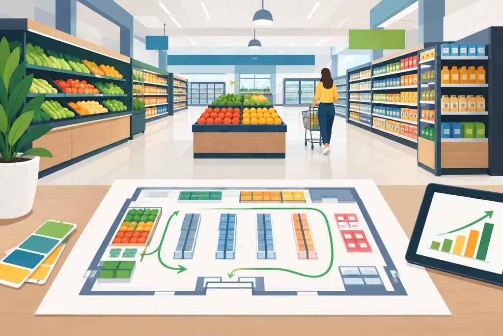
A supermarket layout is not simply a floor plan filled with shelving. It determines what shoppers notice, how easily they find essentials, how long they remain in the store, and how efficiently staff can replenish stock. Knowing how to plan supermarket layouts means balancing customer convenience with commercial priorities, from high-margin impulse lines to cold-chain requirements and checkout security.
For supermarket operators, fit-out contractors, and retail project teams, the strongest layouts begin before the first gondola is ordered. A practical plan considers the shopper mission, available floor area, product mix, service departments, fixture sizes, and the operational routes staff need every day.
Start With the Store’s Commercial Purpose
A neighborhood grocery store, premium food market, discount supermarket, and large-format hypermarket should not use the same layout logic. Each format serves a different shopper mission. A convenience-led store must make fast purchases easy, while a larger weekly-shop destination needs enough structure for customers to navigate a broad range without feeling overwhelmed.
Begin by defining the role of the location. Is it designed for top-up shopping, family stock-up trips, fresh food discovery, or a mix of all three? Then review the planned assortment by department, including ambient grocery, produce, dairy, frozen food, bakery, beverages, household goods, personal care, and seasonal merchandise.
This stage should also establish sales targets and space priorities. High-demand categories may deserve additional facings and wider aisles, but giving every category more space creates an inefficient store. The goal is to assign space according to sales volume, margin, replenishment frequency, product dimensions, and the role each category plays in bringing shoppers through the door.
Measure the Floor Before Selecting Fixtures
Accurate site measurements prevent expensive compromises later. Record the usable selling area, column locations, ceiling height, doors, utility points, refrigeration requirements, emergency exits, and sightlines from the entrance. Include backroom access and receiving routes, because a layout that looks good on paper can become difficult to operate if staff must cross customer traffic to restock essential lines.
Plan fixture dimensions around the actual space, not a generic drawing. Gondola height, bay length, shelf depth, endcap size, and aisle width all affect capacity and customer movement. In smaller stores, lower gondolas can improve visibility and make the space feel more open. Larger stores may benefit from taller runs in selected grocery aisles, provided signage remains clear and the store does not feel closed in.
How to Plan Supermarket Layouts Around Shopper Movement
Most shoppers need a clear orientation point as soon as they enter. The entrance area should feel open, well lit, and easy to read. Avoid crowding it with excessive promotional stock or tall fixtures. Customers often need a few steps to adjust to the store environment, so this zone is better used for a clean welcome, shopping baskets or carts, and carefully chosen seasonal or promotional displays.
From there, create a natural route toward major departments. Fresh produce is often placed near the entrance because its color, texture, and perceived freshness create an immediate positive impression. This is not a fixed rule. In a compact convenience store, chilled drinks or ready-to-eat food may perform better near the front because they match the customer mission.
Place destination categories where shoppers can locate them without frustration. Staples such as milk, bread, rice, cooking oil, and eggs should be accessible, even if they sit deeper in the store. The purpose is not to force shoppers into a maze. It is to create sensible exposure to adjacent categories as customers travel through the store.
A strong customer path includes clear main aisles, secondary aisles, and open cross-aisles where the floor plan allows. Main routes should lead shoppers between key departments and checkout. Secondary aisles can hold grocery categories in a logical sequence. Avoid dead ends where possible, especially near frozen cabinets, service counters, or high-traffic promotional areas.
Allocate Space by Category Behavior
Category placement should reflect how customers shop, not just how products are delivered. For example, pasta belongs near sauces and cooking ingredients, while baby care should be grouped with relevant hygiene and household essentials. Complementary placement encourages larger baskets without making the assortment feel random.
Fresh departments need dedicated planning because they carry distinct operational demands. Produce needs open display tables or angled shelving that protects presentation while allowing frequent rotation. Bakery requires aroma, visibility, and practical access for staff. Meat, dairy, and frozen sections depend on refrigeration equipment, power availability, cleaning access, and enough circulation space for carts.
Beverages are another category where layout decisions affect operations. They generate heavy loads, frequent replenishment, and high volume during peak periods. Position beverage runs where staff can restock efficiently and where customers can move carts without blocking narrower grocery aisles.
Use sales history when it is available, but do not rely on sales alone. A low-volume category may be essential to customer trust, while a high-volume line may require more space primarily to reduce out-of-stocks. The right allocation is a commercial decision supported by operational reality.
Choose Fixtures That Support Visibility and Capacity
Fixtures are the working infrastructure of the supermarket. Standard gondola shelving provides flexible capacity for ambient grocery, while wall shelving uses perimeter space efficiently. Endcaps create high-visibility selling positions for promotions, seasonal lines, new products, and supplier-funded campaigns.
Select shelf depths and load capacities based on the product being displayed. Cereal, canned food, cooking ingredients, and boxed household items have different packaging dimensions and weights. Adjustable shelving gives store teams more flexibility, but it still needs a disciplined planogram so products remain organized and shelves do not become visually uneven.
Keep key sightlines open. Tall fixtures can increase capacity, but they may hide departments, reduce natural light, and make a smaller store feel congested. A useful approach is to use lower central gondolas in customer-facing areas and taller wall bays or selected perimeter runs for reserve capacity.
Display accessories make a measurable difference. Shelf dividers keep narrow products aligned, ticket holders improve price communication, and shelf talkers help call out promotions without cluttering the aisle. Acrylic holders, poster frames, and point-of-purchase displays should be used where they clarify a decision, not simply because display space is available.
Build Signage Into the Layout, Not After It
Customers should be able to understand the store without asking for help. Department signs, aisle markers, promotional graphics, and price communication need planned positions, consistent sizing, and a clear hierarchy. If every message competes for attention, none of them performs well.
Use overhead department signage to support orientation and shelf-level communication to support product choice. A customer looking for cleaning products needs a visible category sign first, then simple shelf labels to compare brands, sizes, and prices. Promotional posters work best at entrances, endcaps, queue areas, and campaign zones where they do not obstruct circulation.
Digital displays can support dynamic promotions, brand messaging, and seasonal campaigns, particularly in high-traffic areas. However, they should complement the store environment rather than replace clear physical signage. A poorly positioned screen can become background noise; a well-positioned screen can direct attention to a promotion or service department at the right moment.
Protect Checkout Flow and High-Value Merchandise
Checkout is both a service point and a critical control area. Plan enough queue space for peak periods without allowing lines to block grocery aisles or the entrance. The area should offer clear access to payment counters, bagging space, exit routes, and customer service where required.
Impulse merchandise can work well in checkout zones, particularly small snacks, beverages, confectionery, batteries, and travel-size items. Keep the assortment controlled. Overloaded checkout displays slow transactions and make the area look untidy.
High-value products such as electronics accessories, premium cosmetics, infant formula, or selected health items may require secured displays, anti-theft systems, or placement within staff sightlines. Security decisions should be made while planning the floor, not added later as a reaction to shrinkage. The most effective solution depends on product risk, local loss patterns, staffing levels, and the intended customer experience.
Plan for Replenishment, Cleaning, and Changeovers
A layout succeeds only when staff can maintain it. Every department needs practical replenishment access, especially fast-moving grocery, chilled products, and beverages. Leave enough working room around refrigerated cases, promotional stacks, and service counters for cleaning, stock rotation, and maintenance.
Consider how promotional areas will change throughout the year. Seasonal campaigns, Ramadan displays, back-to-school stock, holiday gifting, and supplier activations all need flexible locations that do not disrupt the permanent department structure. Endcaps, freestanding display units, and designated promotional pads give teams a controlled way to refresh the store.
Before installation, walk the planned layout as if you were a shopper, cashier, stock associate, and delivery team member. Test cart turns, sightlines, aisle widths, service counter access, and emergency egress. This final review often reveals small adjustments that prevent long-term operating problems.
The best supermarket layout makes shopping feel easy while giving every fixture, sign, and display a clear commercial job. Plan it around real customer behavior and daily store operations, and the selling floor will work harder from opening time to close.